Editor’s note: The contents of this column are intended for satirical and entertainment purposes and do not necessarily reflect the opinions of the IDS or its staffers. The scenarios mentioned are fictional.
It’s apparent that the mood in Bloomington has been brighter in recent days: birds are chirping more, the air feels crisper and students are practically skipping between their classes. The reason is obvious to habitual viewers of City Council’s livestream — the unveiling of a new city logo.
The new city logo, lovingly referred to by its fans as a “butt,” took Bloomington by storm when it was released by the council on Sept. 2. Gone is the city’s 1986 emblem, a fussy little arrangement of peonies, trout lilies and quilt-pattern stitching meant to evoke “community interaction.” In its place: two enormous, rounded lobes, pinched together at the center, rendered in a heavy, contemporary sans-serif that resolves, depending on the angle, into either a stylized “B” or something considerably less civic-minded. City officials maintain the ambiguity is intentional, claiming the logo should be “open to interpretation.”
This masterstroke of marketing emerged from the 2016 Wage Growth Task Force Initiative, intended to give Bloomington “a stronger, more sustainable economy.” For nearly a decade, the initiative toiled in secret, paying the most expensive consultants to design a perfect logo. Those years of labor have now concluded, creating a case study in “synergy” which will be taught in Indiana University’s Kelley School of Business for years to come.
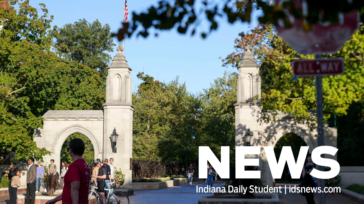
The transformation has been visible everywhere. Landlords, moved by the new visual identity, voluntarily lowered rent to reflect the city’s “renewed sense of shared purpose.” The line at Mother Hubbard’s Cupboard vanished by midweek, replaced by a line of former clients now waiting to apply for jobs at the food bank, itself rebranded as a “community abundance hub.” Kirkwood panhandlers, once a fixture of the avenue, have transitioned into brand ambassador roles, greeting tourists and pointing out the logo on manhole covers, city vehicles and, as of Wednesday, the Sample Gates.
Council members reported that constituent emails about affordable housing dropped to zero, though several noted this may be because the city’s contact form is currently being redesigned to match the new brand.
“I can think of no better way to spend $95,000 of taxpayer money,” Councilmember Bea Letterhead said. “Affordable housing and low wages are complex issues, and rebranding is a simple solution.”
Reached for comment on how the logo accomplished this sudden revitalization, the city’s Director of Innovation and Narrative Strategy clarified that poverty had not technically been eliminated. Per the newly adopted 652-page brand guide, residents without stable housing are now classified as “community members experiencing untapped potential.” Wage stagnation has been retired in favor of “sustainable earnings agility.” The unemployment rate, a spokesperson added, was never especially attractive in the old font anyway.
“The only shortfall,” local entrepreneur Claude Musk said, “was that AI could have done the job for free.”
Spencer Robinson (he/him) is a junior studying public policy analysis and law and public policy. His commentary can also be found on his Substack.