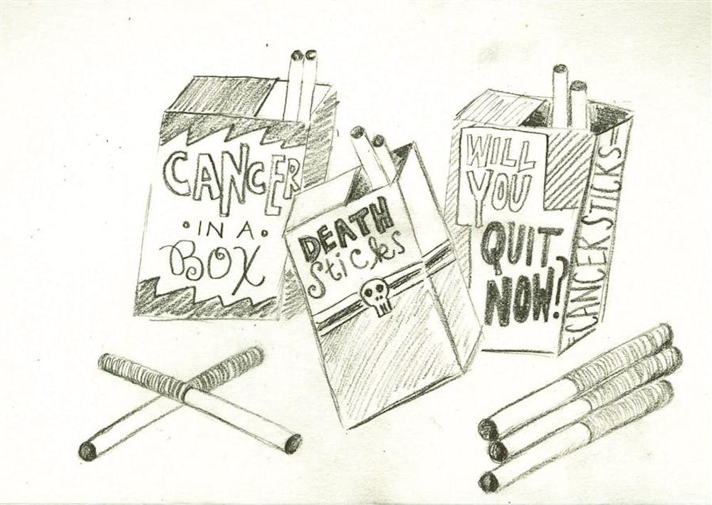
Putting graphic imagery on cigarette packages is a potentially positive idea. Getting the image of rotting teeth and respirators into smokers’ heads every time they light up is bound to have some effect on their usage. I just worry that people will become desensitized fairly quickly.
—Chelsea Eales, BFA Graphic Design
Health information is education and seems fitting but on the package it is also intrusive into private business. Weighing all these factors, I think this is intrusive but a natural next step in making smokers think hard about the health risks and emphasize how distasteful smoking can be socially.It is also intrusive into my profession, graphic design. This was proposed in the 1990s by Tibor Calmanm, a well known New York graphic designer. His idea was to not allow attractive graphic design on packages of poison. He suggested a plain wrapper with the name of the cigarette brand and the legal warning.
—James Reidhaar, Associate Professor in Fine Arts
Even though I believe the FDA has good intentions, I think the mock-ups they provided come across as unprofessional and somewhat amateur. Because of this, it is hard to take the warning labels seriously. They may end up as pieces of humor rather than the pieces of information they are meant to be.
—Nathan Bilancio
The photographs are highly effective in relaying these warnings about smoking. However, many of the type faces used are not very effective in threatening me about smoking. There are one or two unique bold styled type faces that are being used that do attract my attention. These force me to understand the warnings about smoking.
—David Piercy, BFA Graphic Design
I personally think this is over the top. The design almost seems to be parodying itself with shock imagery rather than clearly informing especially in an age where we are raised knowing the that smoking is bad for you. None of this is new. People are aware of the risks. People take them for the social benefits. I think a social angle would be more effective because though people try smoking for social acceptance, you alienate yourself from a larger group of people by taking up smoking in the process.
—Alysha Balog, BFA Graphic Design
I think what these proposals forget is that smoking is horribly addictive and that scaring current smokers isn’t the same as helping them quit. With that said, I could see how the visuals may be effective in deterring those who do not smoke from starting.
—Matt Basore, BFA Graphic Design
It seems pretty over the top. A lot of other products are really bad for you but don’t have this kind of packaging. But I think the design would definitely be effective in preventing people from buying the product.
—Audrey Green, BFA Graphic Design
Although I think this is a step in the right direction, it’s hard to take their visual appearance seriously.
—Cristina Vanko, BFA Graphic Design
Graphic designers weigh in on FDA cigarette labels

Get stories like this in your inbox
Subscribe


