The Fine Arts Library welcomed a third author in its series celebrating working artists who have published works that push the limits of traditional bound book form.
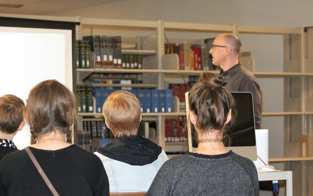
David Wolske, visiting assistant professor of graphic design at the School of Art and Design, spoke at the library Tuesday surrounded by the books, standing pieces of art and students listening or working at tables around the library.
Throughout the lecture, Wolske showed examples of his work and talked about the thought and typographic insight that went into certain stylistic decisions with the intimate group of about 10 students and Fine Arts faculty.
The overarching theme of the work was an exploration of space.
“I’m interested in the space between words and letters — how that influences the rhythm of reading and how that influences reading,” Wolske said.
Wolske also said if he had to describe his work in one word, it would be contrast, because he explores various levels of contrast through his work in wood and metal-based typography.
Wolske received his bachelor of arts degree in studio art at Marian University in Indianapolis and an MFA in graphic design from IU.
Jasmine Burns, interim head of the Fine Arts Library, said Wolske frequently teaches typography, graphic design, letterpress printing and book arts classes around the United States.
“David’s methodologies reveal an affinity for handset wood and metal type but also enthusiastically incorporate digital tools, computer software and design thinking,” Burns said.
During the lecture, Wolske went over some of his past dilemmas with, including questions as to the reasons why he was doing the work he was doing while in graduate school.
“I felt like there was something missing,” Wolske said. “I started questioning the methodology, why I would reproduce something that I had already designed? Why would I design it again and spend hours and hours hand-setting it and printing it so laboriously? I’ve already done all of the creative work.”
Wolske said he then reworked his process over his final three semesters and began working more spontaneously and intuitively.
Though the work stayed consistent to his style and did not show dramatic change, Wolske said motivation to create the works was more process-driven.
“I would go into the studio really with very little idea of what I was going to be working on, and, over the course of hours, the project would develop,” Wolske said.
Now, Wolske has completed various manually typed and printed projects, including a visual haiku randomizer, which allows the viewer to shift sections of a page to create a new image. The forms of the projects differ from traditional books.
Wolske also showed the audience a work related to gender roles in the workforce. It was the first piece he worked on designing with Red Butte Press.
“It was interesting because I was the only male working with six incredibly talented, fiercely intelligent, just amazing women,” Wolske said. “This project came to us and was an exploration of the dichotomy of gender roles in labor.”
The form of this particular work ended up resembling both an “m” and a “w,” reflective of the themes of men at work and women at work. Playing with that comparison lent itself to the theme, Wolske said.
Wolske explained his creative typographical process in a variety of ways, one of which took on an alternatively artistic lean.
“I think of this almost like jazz, where I’m responding to each of these elements as a performer or player in an ensemble,” Wolske said.
Wolske emphasized that in many respects, the role he played in his creative projects with Red Butte Press was as part of a greater group effort.
“I had a small part in producing these,” Wolske said. “I would print occasionally, I would help with the binding. My primary role was in creative and art direction and designing these things. We had an incredibly talented team that produced these — book art is a collaborative endeavor.”