
Background
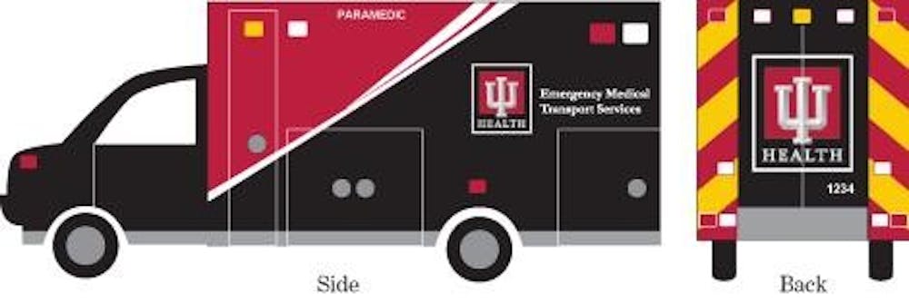
All Clarian Health hospitals adopted a new name on Jan. 25. Sixteen hospitals now have Indiana University Health tacked onto the front of their names — for example, Bloomington Hospital is now Indiana University Health Bloomington Hospital — to reflect Clarian’s partnership with the IU School of Medicine. This name change was announced in May 2010, but became official two weeks ago when a new logo, signs, website, helicopters and ambulances were unveiled. All of these newly branded materials contain a color typically taboo in the health care design industry — black.
Bloomington hasn’t yet switched all of it’s ambulance fleet over to the new design, but will in the coming months.
Why black?
I talked to Roys Laux, IU Health director of brand and service line marketing, and Margie Smith-Simmons, public relations manager for IU Health, to find out.
Laux said they wanted to keep the IU Health logo familiar, but not exactly like the traditional block IU. So they chose two primary colors from the IU color palette: red and black. Then, Laux said primary research was done with more than 300 Indiana residents. In one test, one group was shown a logo that had a significant amount of black in it and the other was shown a logo with significantly less black, or just an outline. Participants were then asked a series of questions to identify the strength of the logo.
The logo with a significant amount of black scored higher than the other, Laux said. Not one participant in the group that was shown the mostly black logo said they associated the logo with feelings of death.
IU Health took those results and applied the findings to the helicopters and ambulances. Seven different designs were proposed for the helicopters and ambulances; some primarily used red, some primarily used cream, and some primarily used black. Laux said IU Health chose to go with the black for a few different reasons. First, it differentiates the IU Health ambulances from other ambulances in the area, and from police cars and fire trucks. Second, it solidifies the IU Health brand by repeating the black in the logo on the emergency response vehicles.
Potential problems
Isn’t black harder to see at night? Not according to Steve Johnson, IU Health LifeLine program director. Johnson said when you’re talking about ambulances you’re looking for contrast. The contrast that reflective material has on black is highly visible during the day and at night.
Won’t people associate the black ambulance with death? Laux said no one in the primary research groups associated the black used in the logos with death, but no primary research was done to show if people associated the ambulance design with death, or, if people confused the design with other vehicles like SWAT trucks or armored cars.
Why not just keep the ambulance white, like all the others? Laux said it was important to differentiate the IU Health ambulances from other ambulances in the area, and from other emergency transport vehicles.
Are there other ambulances using dark colored designs? Laux said they did consult with other places across the country who use dark colored (primarily navy blue, or black) designs. Superior Ambulance Service in DuPage County, Ill. and Iowa Health in Des Moines use darker colored ambulances.
My take
The transition to Indiana University Health will no doubt strengthen the reputation of the hospitals involved. As one branding expert said in an Indianapolis Business Journal article, “I feel like to the average guy, that seems like an upgrade.” And I agree. While I don’t think there’s a problem with the use of black in the logo — by using the black, the word “HEALTH” actually pops much more than it would on a white background — carrying that black down to the ambulances is a mistake.
First, the IU color palette does contain black, but it’s rarely used as a primary color. Ask anyone what IU’s colors are and you’ll get “cream and crimson” or “red and white.”
Second, the conclusions from the primary research conducted on the logo shouldn’t have been carried over to the helicopter and ambulance design. They use significantly more black than the logo and have a very different function.
Third, if reflectors on black ambulances are easier to see at night and they are highly visible in all lighting conditions and you can differentiate them from other emergency response vehicles, then why aren’t more health systems using them?
Finally, the ambulances, while not completely black, do have a grim look to them. Some might say they look sleek or professional, but there are other ways to achieve a sleek or professional look without using black.
Safety is obviously of primary concern to IU Health, and Johnson told me these ambulances are top-of-the-line and far exceed the guidelines set forth by the state. I’m not questioning the safety or effectiveness of these ambulances, but colors matter. They can affect your feelings and your mood. Overjoyed. Nostalgic. Grim.
Ambulances are used to help people when they are in dire need and are often at their most vulnerable, so why take a chance that someone would turn it into an association with death?
Health care (branding) overhaul
Typically, black isn’t a primary color used in the health care industry for obvious reasons — the color black is closely associated to death. Indiana University Health system went against the grain, and featured black not only in its logo, but on its
Get stories like this in your inbox
Subscribe


